7 Moroccan design details I loved
This is a love letter to zellige tile and potted palms
Hi friends,
Writing you from my homely little abode, where I’ve been contemplating our Simply White walls while scheming about painting my house in terracotta hues, filling it with potted palms, and tiling every visible surface…
While I won’t actually get swept up in redesigning my entire home, I did *take notes* on the alluring interiors — and exteriors! — of Morocco. Today, I’m talking about seven details I loved and the design lessons I’m taking home with me:
1. Open courtyards.
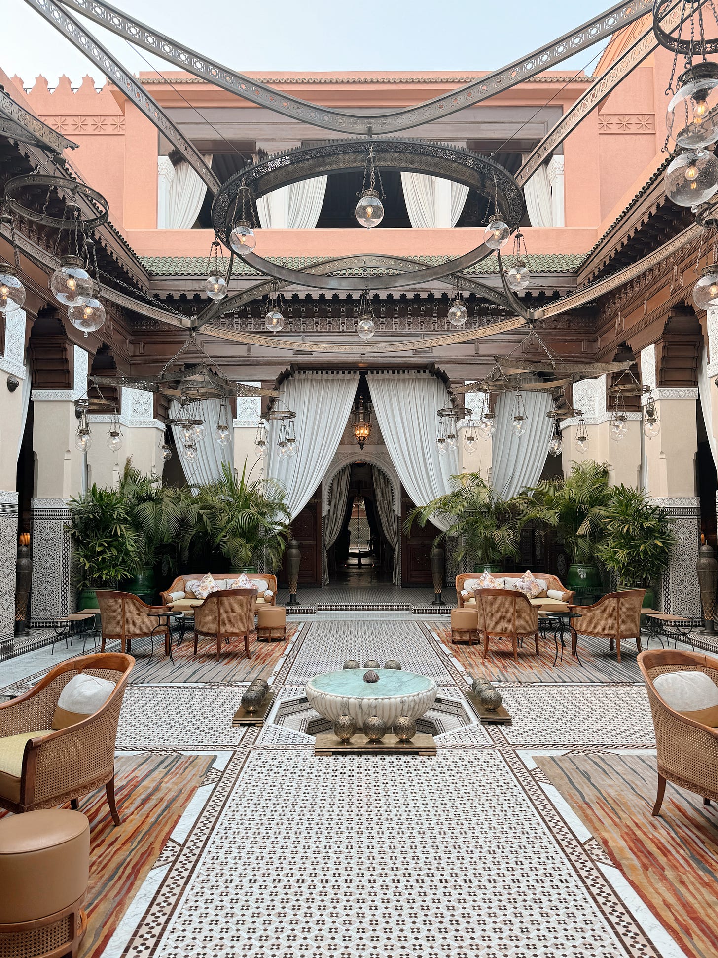
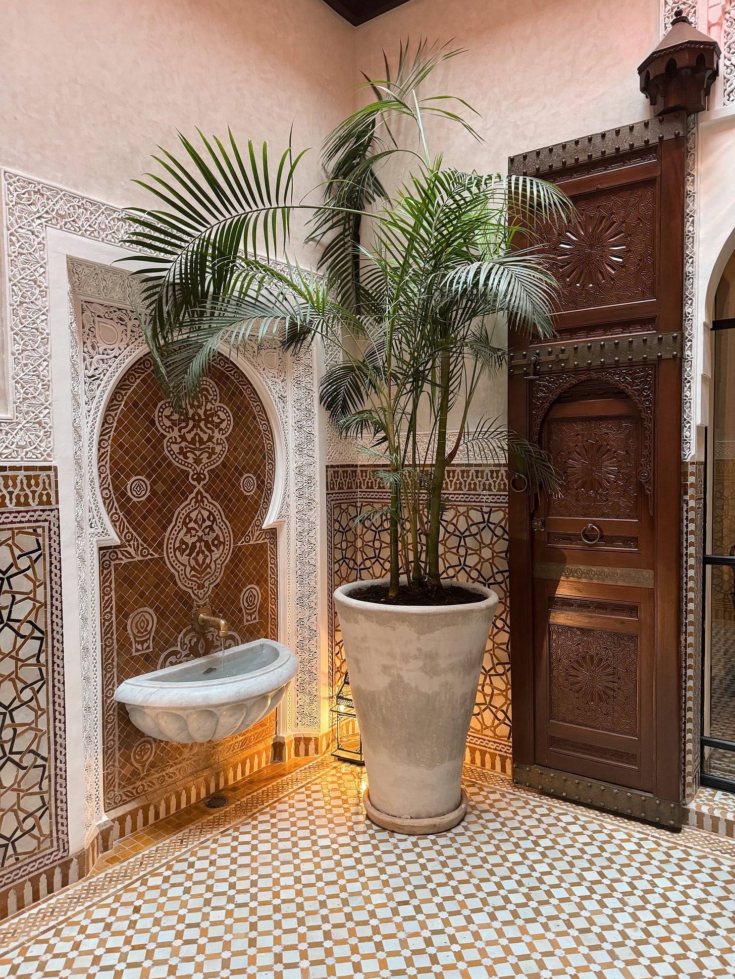
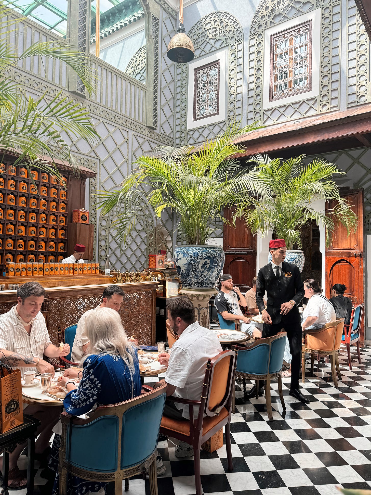
Courtyards, ya’ll. I’ve decided we need more of them. In Marrakech, we’d be hustling through shadowy alleyways of a chaotic medina and then step past some huge, carved cedar doors to find tranquility. Lightness. Relief. Inside traditional Moroccan riads, there’d be an open courtyard — swathed in intricately patterned tile, alive with greenery, with a little fountain bubbling at its center. Loved.
2. Water features.
Traditionally, a riad features an interior symmetrical garden centered around a water fountain. A vestigial symbol of the wealthy (one, it meant you could afford an interior garden, and two, you could afford running water in your home), today, its delicate trickle adds a soothing ambiance and musicality. Even in the private riad we stayed in, there was a small fountain in our tiny entryway courtyard.
Tbh, we removed the water feature from our back patio when we remodeled, and now I can’t help but think we made a grave mistake…
3. Stunning outdoor tile.
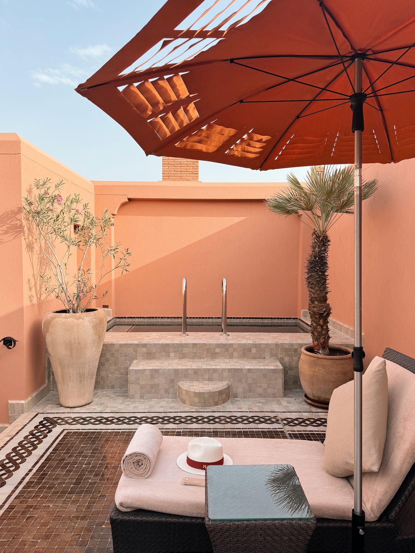
While we often consider our kitchen and bath tile choices with care, I think we’re prone to overlooking the ways outdoor tile can bring artfulness into our outdoor spaces. Our riad even had a rooftop plunge pool with the most beautiful zellige tile — what pool dreams are made of!
4. Indoor-ish furniture outside.
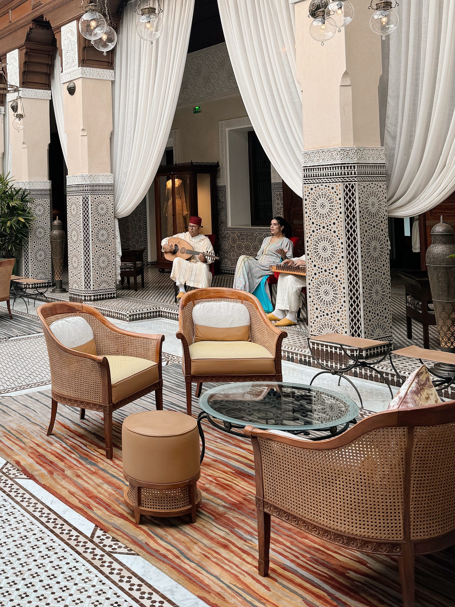
The courtyard of our Marrakech hotel was downright opulent: caned furniture, silk pillows, leather ottomans, colorful rugs, and potted palms under the open sky. By bringing furniture that looked like it belonged indoors outside, the outdoor space felt both luxe and livable.
Of course, the day there was a torrential downpour, the staff had to move the entire living setup inside — something that I’d have neither the space or manpower to do. But it’s a good thought starter on how to make outdoor spaces feel much more inviting.
5. Heavy candlelight.
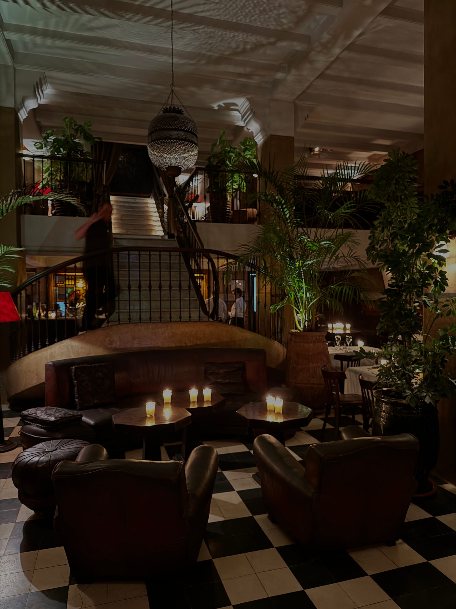
At both Le Grand Cafe de La Poste and Sahbi Sahbi in Marrakech, a table for two might have three glass candles on it — bathing their dining rooms with cozy, flickering light. Inside the riads we stayed at, oversize lanterns holding pillar candles lined the walkways.
6. Sculptural potted plants.
Potted plants were everywhere — inside coffee shops, adorning courtyards, even dotting the rooftop of our riad. I haven’t necessarily been drawn to palm trees historically, but that’s likely a byproduct of being influenced by what the algorithm has served me in recent years. After a few days of being assaulted by palm trees — color me convinced that I need these frondy beauties in my life.
(Something that remains a mystery to me is how restaurants with so little sunlight appear to be cultivating indoor jungles. When we dined at the cavernous Chinese Tuxedo in Manhattan last month, which had the lushest of greenery inside, I wondered — are they moving plants outside and back inside each day?! I need deets.)
7. Thoughtfully considered ceilings.
Something I didn’t even pick up on until when I was scrolling my photos on the flight back was how design almost always extended to all four walls. From the beams above to geometric tile to intricate wood carvings, ceilings were rarely an afterthought. (Flat white paint? They would never.)


