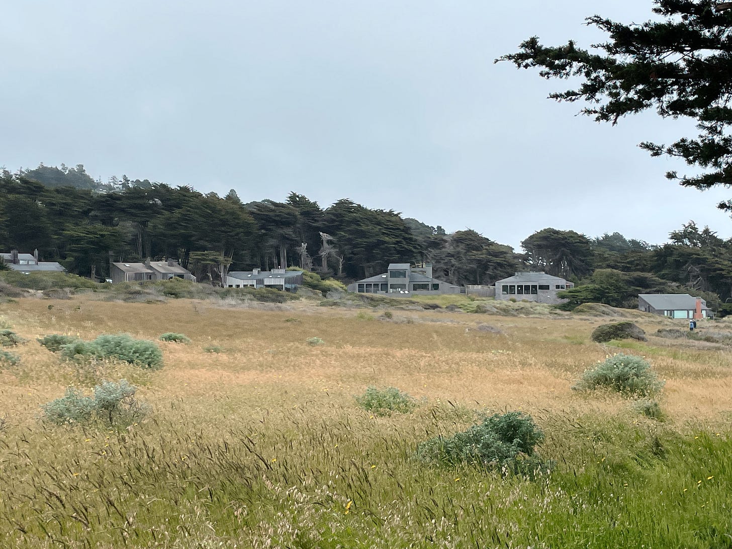
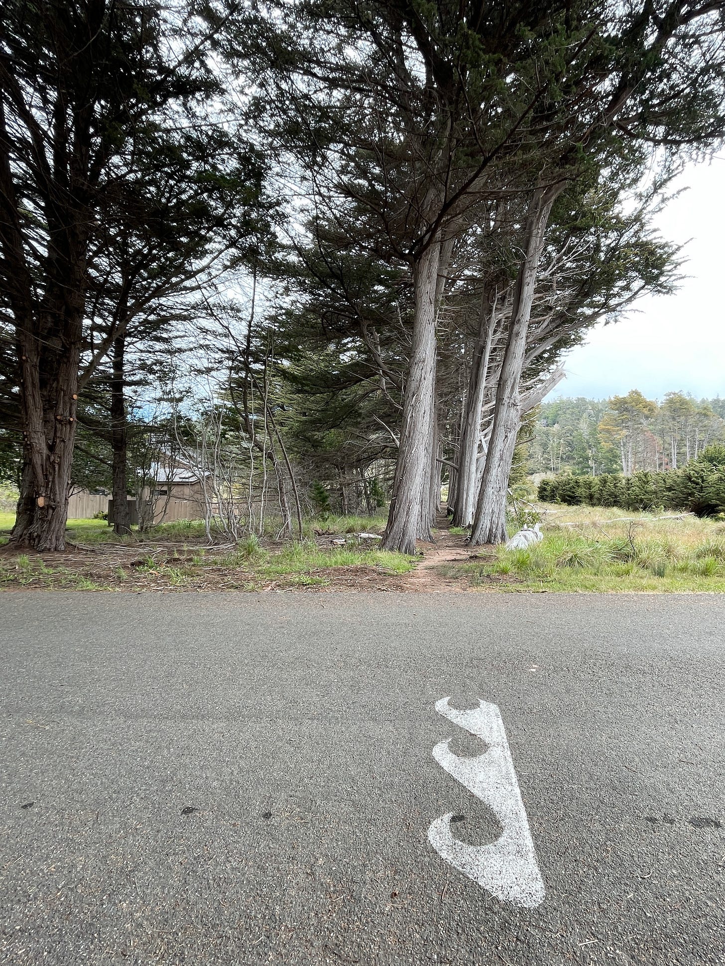
In Sea Ranch, your outdoor lights must be shaded. Cars have to be parked behind a fence or otherwise “adequately screened from neighboring property.” Visible landscaping can only include native species from the approved plant list. Your house must be built in a prescribed architectural style—and stained only in one of seventeen pre-approved finishes. A design committee reviews all new construction.
The result is a place where the homes blend into the land, there’s no light pollution, and all the signs are in Helvetica. It’s an entire community that *claps with delight* adheres to the brand guidelines.

I knew little about Sea Ranch and its history before my recent visit. My friends Brian and Jean threw out an invitation to join them at their vacation home up the coast of California, about a three-hour drive from San Francisco.
Hours later, my mother and I loaded our overnight bags into her 2000s Lexus sedan. Configuring her never-used Bluetooth while driving seemed insurmountable, so we listened to her lone ABBA CD after FM radio cut out. The quieting of choices felt like an appropriate metaphor.
When you zip around the curvy Sea Ranch roads, it’s all sparsely set wood-clad, slanted-roof buildings set in sprawling meadows, with cypress trees and ocean bluffs as far as the eye can see. There’s a palpable peacefulness and a profound sense of place. I marveled aloud, “This place is a brand person’s DREAM! A designer haven! An architectural delight!” and peppered my friends with questions. “Just how did it become this way? How did they achieve these curated minimalist vibes?”
Sea Ranch wasn’t just born by accident or whimsy; it turns out there’s a design manual for the community, because of course there is. Dreamed up by a group of architects and designers in the 1960s, the coastal development was a highly deliberate endeavor, grounded in the the principles of good design, economy of space, and harmony with nature.
You know when you’re in a hotel room and there are no cords or fuggo devices or blinking neon lights coming out of HVAC control panels in your line of sight? For a 10-mile stretch of the coast, it’s like someone took tender care to do away with all of that visual clutter. Nervous system, settled.
“I realized that it was this character that I hoped we might achieve at The Sea Ranch, a feeling of overall place, a feeling of a community, in which the whole was more important and more dominant than its parts.
If we could achieve that—if the whole could link buildings and nature into an organized whole rather than just a group of pretty houses—then we could feel we had created something worthwhile which did not destroy, but rather enhanced the natural beauty we had been given.”
—Lawrence Halprin, Sea Ranch architect

The commitment to Helvetica throughout Sea Ranch was delightful—a considered choice of Barbara Stauffacher Solomon, who was behind the signature iconography you’ll find everywhere. Her bold “super-graphics” brought colorful contrast to the otherwise restrained palette. Everywhere I went, carefully considered design:
Having been The Brand Police in many a past marketing job—both by assignment and also by I Just Can’t Help Who I Am—I found myself feeling very much like I was among my people. People who I imagined were likeminded, design-loving souls, willing to sacrifice some personal freedoms and aesthetic choices for the greater good.
I’d venture to guess that the average American shudders at the idea of an HOA, associating them with cookie-cutter suburban developments named things like Pacific Creek and Gardenia Bay. But sometimes I think we could stand to eschew our individuality for a bit more community spirit.
In Monaco and Nice, facades and shutters must be painted a shade from the preapproved color guide. In Cinque Terre, everything is painted in one of the designated "Ligurian pastels," as regulated by an official commissioner of good taste. I struggle to think of places in the US that exude a similar charm…

Aesthetics aside, the communal spirit of Sea Ranch living left its mark on me. Yes, there were plenty of rules (and prickly neighbor enforcers of rules) that I’m sure would be annoying as a resident. Like—let me plant hydrangeas in my front yard if I want to, damn it.
But in the face of our very North American loneliness, maybe collectively curating our shared physical spaces is exactly what we need to create more belonging. Maybe opting in to community above self could be the balm for our feelings of isolation. What do you think?
P.S. if you liked this letter, I’m told that clicking the heart button helps it get seen by more readers. (Or leaving a comment! I live for a comment.) I know—I’m a slave to the algorithm. And if you’re inspired to visit, why not forward to a design-loving friend? THANK YOU. 🤎


I went to a museum exhibition about Sea Ranch a few years ago and I do remember finding it very interesting and peculiar. I get the architectural beauty and admire the commitment to a unified way of living, but I can't help but wonder how exclusive and unwelcoming it must be. Reminds me of when my friends and I were gawked at in the Hamptons when we were at a private beach (which we were entitled to with our rental home!).
All that being said, I do live in a HOA community and find a lot of upside to community living. Maybe it's just different once you're on the inside.
Well this was a fabulous read, again. Loved this ❤️